![[Photo by Michelle Dwight.]](/~jashank/assets/images/profile/9/profile-9-sq.png) Jashank Jeremy
Jashank Jeremy
iTunes 11: Making iTunes worse
Sunday, 2 December 2012; 6 pm
iTunes 11 was released a few days ago, and my first conclusion is that it violates POLA so badly I reverted to iTunes 10.
Out of the box, it hides most things iTunes 10 (and iTunes 9, too) showed, moving with Apple’s unappealing iCloud mentality. But once you wrap your head around Apple’s ridiculous bloating of user interface elements, it’s effectively the same.
My first issue was, of course, media keys. They didn’t work, but I
hammered on them for a bit, and they started working again, so it’s
likely something wrong with the media key handling. Nonetheless, the
behaviour is still counter-intuitive. And then I discovered Apple
~~removed~~forgot to put in useful shortcuts like ^⌘Z, the zoom
shortcut. Naturally, too, issues with multimonitor spaces and
full-screening apps haven’t gone away, and don’t work at all
intuitively.
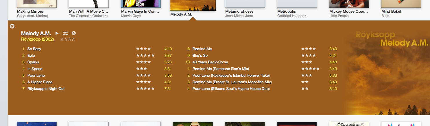
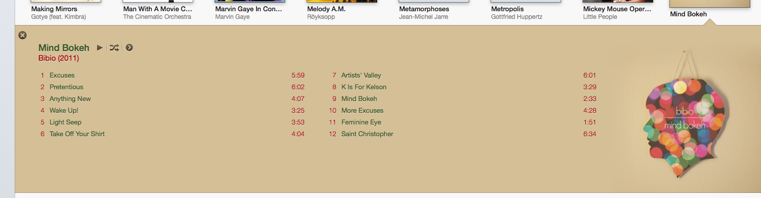
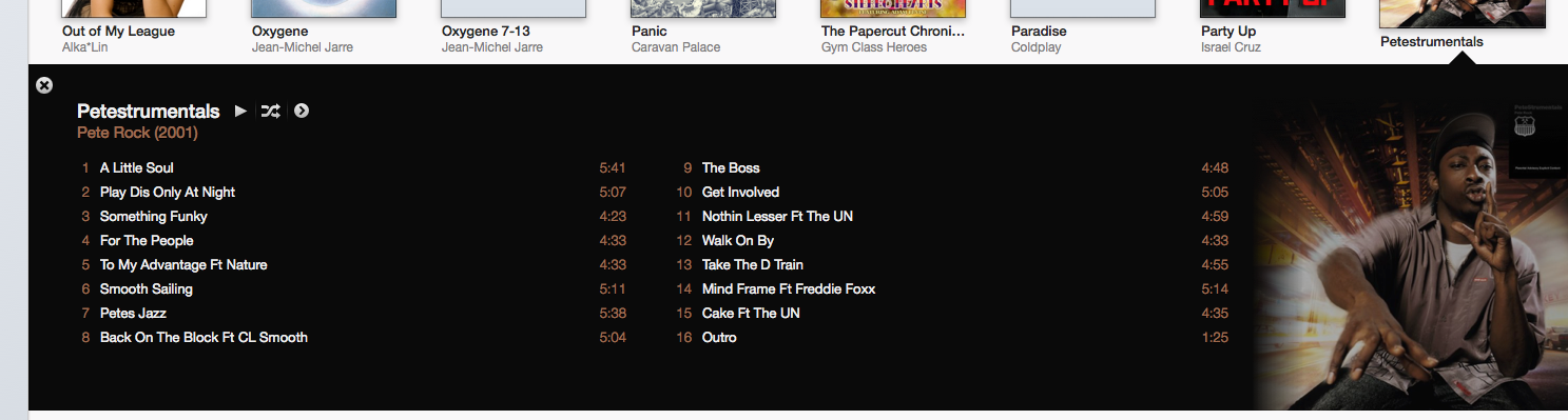
The only nice feature I’ve found so far is the album preview, only available in the Album view. It does a surprisingly good job of picking the colours from the album art; for instance, Melody A.M., Mind Bokeh and Petestrumentals:
But, as usual, it’s still a passable product, and I don’t think any of the gripes I have about it would really influence the average consumer of music against using that particular product.
Related Posts
- The Art of Science Fiction 08 Oct 2013
- Review: The Inevitable End 05 Nov 2014
- Host Naming 09 Apr 2014
- The Beauty of Music 02 Dec 2012
- Mobile Phones: Assorted Thoughts 31 Jul 2013
About this post
- Date & Time
- 2 December 2012, 18:20:06
- Words
- 285
- Tags
- itunes