![[Photo by Michelle Dwight.]](/~jashank/assets/images/profile/9/profile-9-sq.png) Jashank Jeremy
Jashank Jeremy
Typeface Grand Tours: Oroton
Saturday, 31 August 2013; 1 pm
For the first in my series of Typeface Grand Tours, I had a look at the Oroton website and said, “hm, I recognise some of these fonts!”
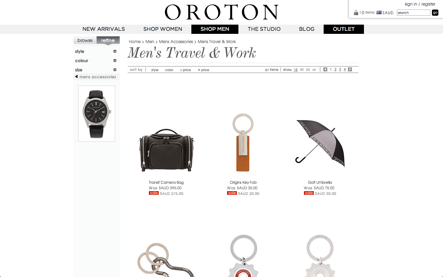
The navbar is in the glorious Gotham HTF from Hoefler and Frere-Jones, a really pretty font and one that I quite like and use on occasion for web design work. Gotham is the official font of the NSW Government and is used in all branding material, amongst other things. The ABC News branding is all Gotham, which I hadn’t noticed, although their website uses Proxima Nova because, I suspect, they haven’t been assed to fork out for the millions of pageviews they get to license Gotham from H&FJ via cloud.typography. Not that it would cost that much; cloud.typography’s pricing guide suggests they’d probably manage to fit in 20,000,000 pageviews/month (which sounds about reasonable) at ~$300 USD/month.
The heavily serifed italic face is De Vinne Roman from Bitstream (now Monotype), which looks very nice and makes me think Didone. My suspicion is that the ‘Oroton’ logotype itself is De Vinne too, I’m also a fan of the Computer Modern family, which are all Didone in nature. That twigged me to what the matching body sans serif was: it’s TeX Gyre Adventor, a twist on the traditional ITC Avant Garde Gothic substitute, URW Gothic L.
The TeX Gyre group appears to be replacements for all the standard PostScript Type 1 fonts (Avant Garde becomes Adventor, Bookman becomes Bonum, Zapf Chancery (!) becomes Chorus, Courier becomes Cursor, Helvetica becomes Heros, Palatino/Palladio becomes Pagella, Century Schoolbook becomes Schola and Times Roman becomes Termes) — and this is done in much the same way that, under most circumstances, the URW++ families are used for the PostScript core fonts in GhostScript and a few other PostScript engines.
Other than the fact that all the scales are wildly off-balance on Oroton’s website, it looks utterly fantastic.
Something something addiction to web typography.
Related Posts
- The Art of Science Fiction 08 Oct 2013
- Host Naming 09 Apr 2014
- Content Preparation 20 Sep 2013
- The curious incident of elspeth in the mid-afternoon 08 Jun 2014
- The Beauty of Music 02 Dec 2012
About this post
- Date & Time
- 31 August 2013, 13:33:19
- Words
- 332
- Tags
- typography, fonts, web-typography, typeface-grand-tour, and oroton
- Extracted from
- Day One